Monday, 30 June 2014

CONCEPT : Blog entry 21

Experimentation in Photoshop - Stoatally different, Weaselly recognised
Have just ben messing around tonight, continuing to try out drawing different animals in this style. This stupid joke popped into my head, so I thought I'd use it to try and create something new.
One of the things about Matt Sewell's book that I particularly like is the little bits of humour; I think it helps it appeal to a wider audience, this is something that I'm considering trying to work into whatever it is I end up making. I also really like the collective nouns, some of them are quite odd and funny, and a little bit different - I don't think they're not something that is commonly known. Again, something that I need to look into more.
Photoshop experimentation - Weasel

Photoshop experimentation - Stoat

And just incase you were wondering, these are the differences between a weasel and a stoat:

CONCEPT : Blog entry 20

Tried using the same technique I have been using with my images of birds with a fox to start off with (I'm going to try more animals later today too).


Experimentation - Fox


Experimentation - Fox
Just blocks of colour wasn't working with this, just white black and orange made it look like a blob, so have used slightly different shades of the colours to add some very simple and slight definition; just enough to convey the shapes of the animal, this works much better. I've had to do this with parts of the bird images to make them work too; things like the beaks, witch needed some more definition to look more realistic, and the eyes. To make the eyes work, I have to use quite a few different layers and shapes to get thy to work. Zoomed out you can hardly tell whats been done, but it makes a huge difference.
But the question is where to stop with the detail? This image I think would benefit from a little more definition in the face, but the whole point of working in this way was to make them very simple, and flat. By adding lots of extra shading and definition, is it making it too complicated again?


Experimentation with silhouette and fur - Fox


Experimentation with silhouette and fur - Fox


Experimentation - Badger
In comparison, the badgers don't seem quite as effective...not enough definition? The very first image I did in this style, of a goose (can be found here) was this simple.
I'm starting to think that the level of definition required will depend on the subject. instead of sticking to one format, maybe instead a set of rules to work to whilst trying to keep everything as simplistic as possible. 
The main aim is to highlight the key identifiable aspects of the animals, and their main colours (easily identifiable, breaks it down, simplifies) but its what to or not to include after that.
Experimentation - Otter

I didn't want to put whiskers on, as I thought that that was too much detail, I haven't added anything like that in my other images...but this one has just gone to hell. His face is awful, and doesn't look very ottery, but I don't know why, it was driving me mad. I'll come back to otters later. I just wanted to have a go, and I used the same technique I used on the fox, to add shape and shading to it - otherwise he might also have looked like a slug.


Experimentation with silhouette and fur - Otters
Also tried he silhouette idea here too - maybe it's the shape of the otters that isn't helping? Can you tell that they're meant to be otters?


Experimentation  with silhouette, fur & text - Otters
...and then had another bash at making one of these things.

Experimentation - Butterfly

Experimentation - Butterfly & Text
I also did these the other day, but didn't add them to the blog. This didn't work very well, but I think I just need to practice more with working in this way but I think that this technique will work well for butterflies, I just need to spend more time working on it.


I think this is the start of a long journey towards getting this right; I just need to keep working on it, and trying different thing, and seeing what works best. And to be honest; if i do decided to bas this around a nature reserve, the work I have done so far is the tip of the iceberg when it comes to the amount of species I will have to draw..and I still haven't even thought of how I will do a hedgehog...

In the mean time, I should probably also be doing some research into guidebooks/nature reserve signs..and try to get a clearer idea of what it is I might make. I know we only just had a concept panel, but this term seems really short, and before I know it, the next one will be here soon (it is actually only 3 weeks away!!)


Wednesday, 25 June 2014

CONCEPT : Blog entry 19

Have spent the day just experimenting with all my ideas on the computer. Have mainly been working out little problems with how to draw this way; things like eyes, level of detail and gradient and/or iridescent feathers. Trying to experiment with a little bit of everything, but there's still a lot that I wanted to have a go at. I've still got some time, I'm hoping I can have a go with butterflies before I have to leave.
Experimentation in Photoshop -  Chaffinch
This was the first thing I did this morning and, and you can bloody tell. I'll probably have another bash at one of these at a later date, I just wanted to do a couple of finches.
Experimentation in Photoshop -  Bullfinch
This is starting to look better, but then this one was fairly simple to do anyway. Have also added one of my ideas to this one; as well as the colours of the bird on the pallet, there is also a watercolour of what the egg looks like (I'll talk about that more later though)
Experimentation in Photoshop -  Goldfinch

Experimentation in Photoshop -  Hawfinch


Photo from yesterday
Experimentation in Photoshop - playing with text, combining with photography

This is just an idea I had, similar to using the feathers with text. I'm not sue about it  though...need to try it out with more things.
Experimentation in Photoshop -  A Charm of Finches

And then I just combined everything to see how it would look..want to make one of these for butterflies next. The photo text works well here. The drawings look quite sweet together too. This could maybe be a heading for a chapter? or a specific board around a nature reserve?
Experimentation in Photoshop -  Lapwing

Experimentation in Photoshop -  Collective noun/photo
 Not sure this composition of text actually work tat well..it's supposed to read "a Deceit of Lapwings" not sure it it works, but I can work on it, there is so much more experimentation to be done with each little bit of this idea.
Photograph from yesterday


Sketchbook Experimentation - Egg watercolours
After finding and egg yesterday, I thought another aspect to add would be the egg of the bird (also gives me a chance to sneak some watercolour in/more organic texture) here's the bits in my sketchbook followed by a close up. have only used this idea in a couple of designs so far, but I quite like it. Not sure bout it also being on the pallet though, maybe its not clear what it is? There's a couple of other ways I could incorporate this idea, I just need to try them out.

Sketchbook Experimentation - Egg watercolours - Lapwing, close up

Experimentation in Photoshop -  Lapwing mock up


As with the first stuff I did, I thought I'd make a quick mock up, and provide another example of my idea. And there's a couple of different ideas on this one.
First, using the same technique as the flying birds on the title text; I don't think these two work well so close together, in the goose mock up, the birds seemed more effective next to the solid text.
I've also included the egg watercolour on the pallet. I think it's a nice touch, but maybe not for the pallet? is it clear that thats even what it is?? I need a second opinion. I think all of this looks quite nice yadda yadda, but I need some one to tell me all the things I cant see.


Although thinking about it, right now, I suppose; what info will be included on/in this will depend on what kind of 'thing' I make, where it will go, who it will appeal to.
If I were to include the eggs that serves one of two purposes; 
1. hardcore bird identification or
 2. treasure hunt family activity with children. 
So the format it may take if I do decide to include it, will depend upon who I choose to aim this at...

Something else that is usually included in these things is a map, showing where the birds is from/where you can find them; how can I make a map different?..another thing on the list to experiment with.
So far thats;
- drawing animals
- drawing birds
- drawing frogs/snakes/insects
- drawing butterflies
- more ways to add egg texture?
- experimentation with typography/font/photographs
- experimentation 
- Feathers/birds in flight - other layouts ways??


Tuesday, 24 June 2014

CONCEPT : Blog entry 18


I spent the day at Attenborough nature reserve, mainly taking photos but also gathering information. Again this is a small selection of the photos I took today, there are more on my Flickr page, here.


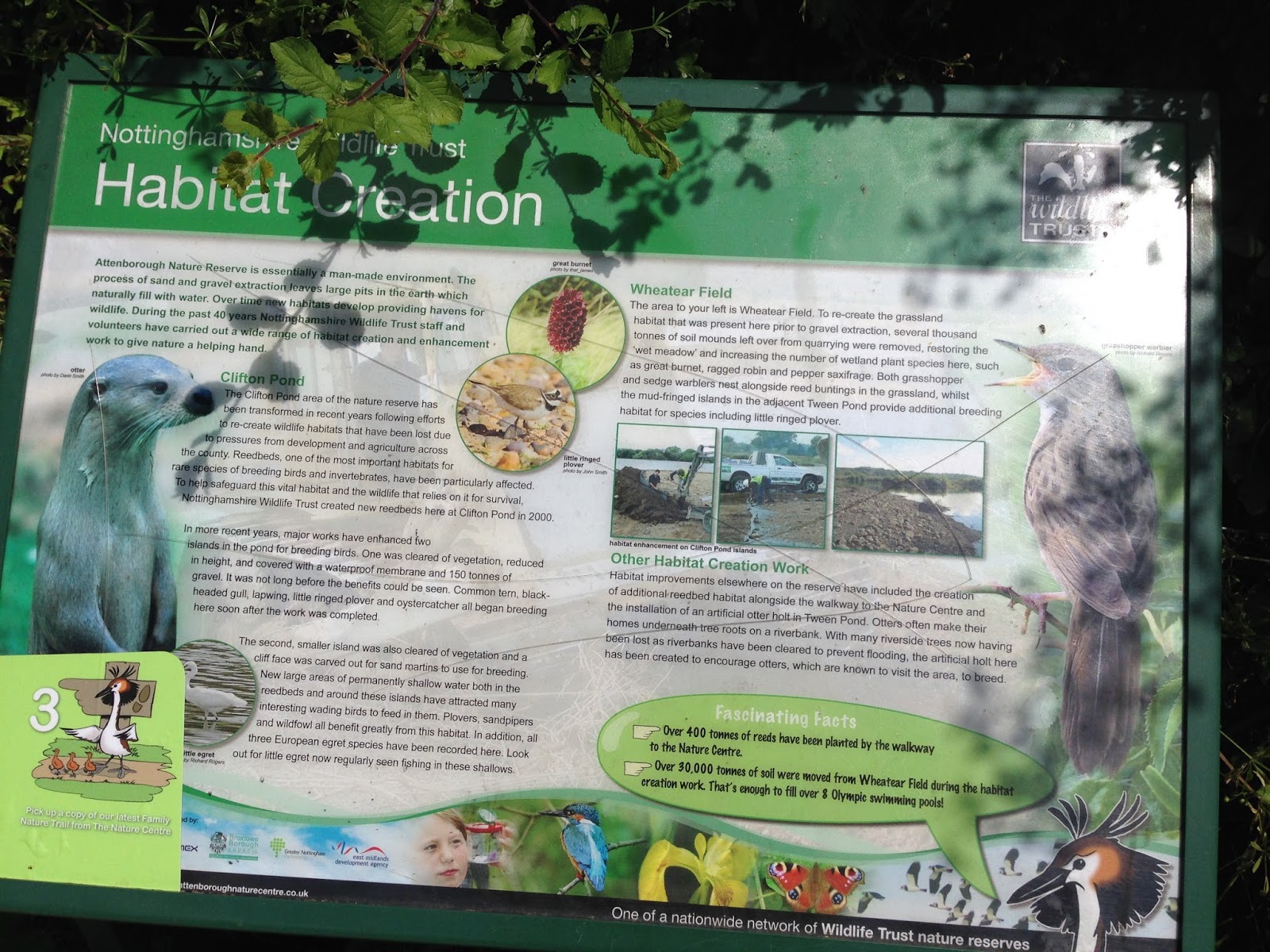
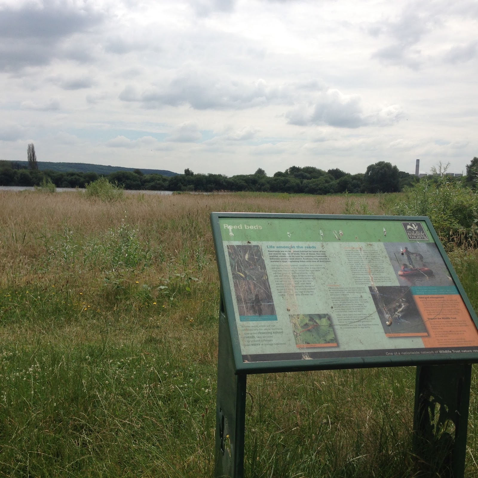
I also took a load of photos of the signs around the reserve, I had the idea of remaking all of these for my project..but I'm still unsure about it. Tomorrow I'll be going into uni and trying out more simplified images of birds and animals, and see how that works.


The photos below, I thought I could use in my experimentation with text, and the bird silhouettes, this is something that I'll do tomorrow too. I really like the combination of flat colours with little bits of photography, hinting at the organic textures around.


I also found an eggshell, and it almost looked like it had been painted with watercolour; that gave me another idea! While I'm going with the idea of using the qulaities of the bird, (and incorporate my watercolour!) I'm going to have a bash at painting some of these to use maybe with text, maybe with the colour palette idea?